baby no. 2 nursery concept
when we found out we were pregnant, the last thing i wanted to do was design another nursery. i enjoyed putting Rowan’s together so much, but remembered how much work i devoted to it and felt like i had used up all of my creativity. i also was going through a funk in the new house where i just wasn’t sure where i saw the rooms going. then something changed.
then something changed…
the creativity turned on and i started scouring the internet
i can’t put my finger on what made the creativity light switch turn on, but i went from one day not even thinking about creating a space for Baby to having spent multiple hours scouring the internet and designing a room concept.
nursery theme
as i started looking at inspiration my love of all things boho surfaced, and fast. instead of curbing this island-living vibe, i allowed to take over, but i also wanted some extra pops of color. so i landed on a unique retro Hawaii meets Palm Springs concept.
when i think retro Hawaii, i think a little groovy, some Elvis and a whole lot of island love. but the addition of the Palm Springs allowed me to add more pops of pink and mid-century.
reto Hawaii meets Palm Springs
a little island, a little groovy & a whole lot of color
my original room layout sketch (take about a hot mess)
this is the latest room mood board. it went through several iterations that included more structure and rigid lines, but as i continued to curate items in real life, the design shifted slightly to include more curves. for example, the rocker. i originally has selected a more structured glider, but when i saw that rocker on Facebook Marketplace for a steal, it just felt like the right decision. so i went for it and changed my mood board later.
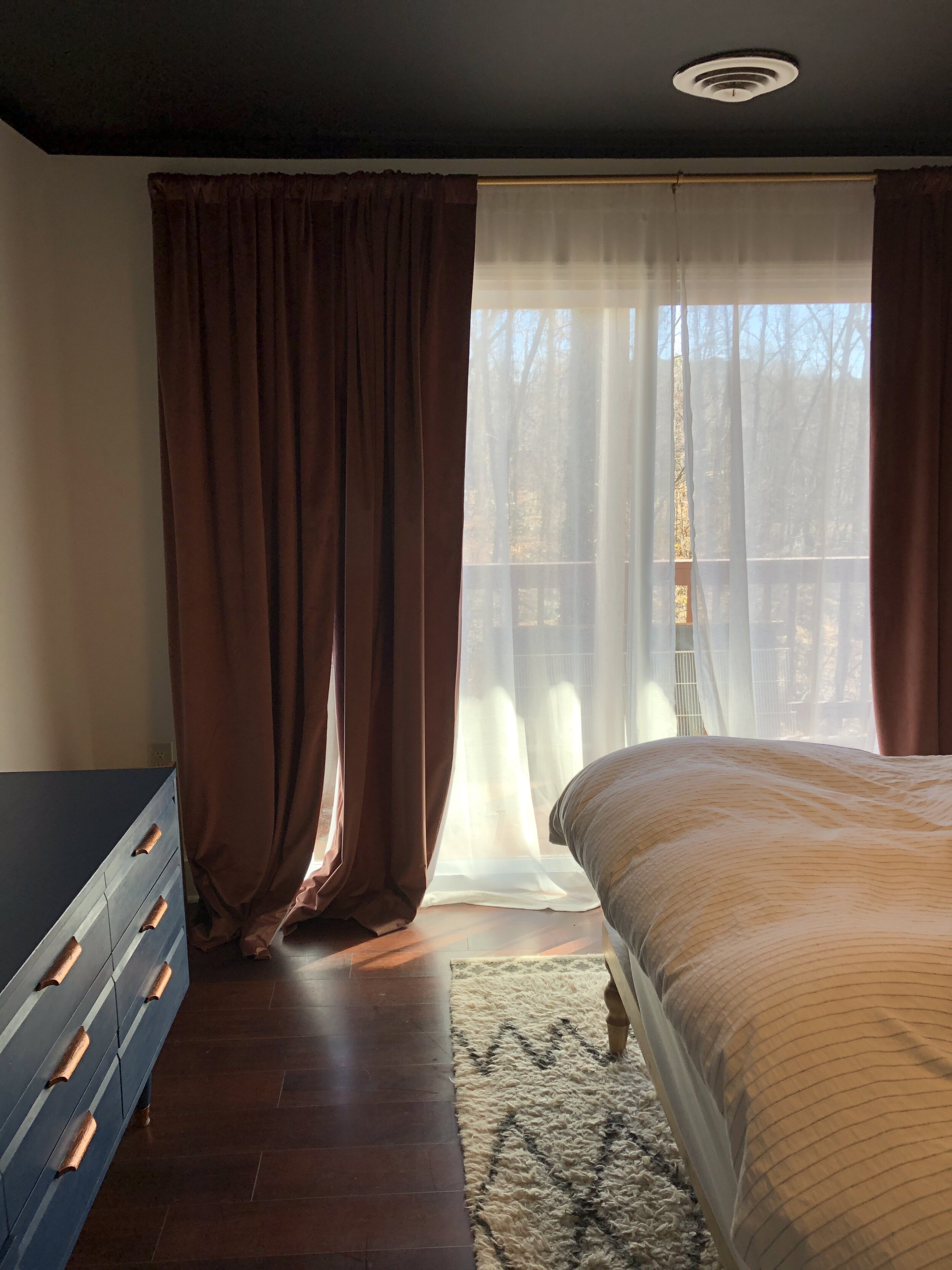
the room before, originally a guest room
in hind sight, i wish i had taken more photos of the guest room - especially when it was all “done up” while my parents were visiting over the Christmas holiday. unfortunately, that just didn’t happen, so here it is in no glory. i also have an instagram highlight from when we were working on the room right after move in.
challenge 1: existing paint
overall, the nursery was a blank slate. we had painted the walls a very crisp white when we moved in, but then painted the ceiling and closet interiors black on a whim. which i still don’t regret - i love the impact it makes. but i knew as i was creating room concept(s) that i wanted to paint as little as possible. for Ro’s nursery, i only painted one feature wall since we lived in the apartment, but even doing that while pregnant was a lot. this time around, pregnancy hit me even harder so i wanted to paint even less.
so rather than consider entirely bright walls, i liked the idea of a smaller painted feature, like that gorgeous abstract clementine-colored element in the mood board.
challenge 2: double closets but a somewhat smaller size room
the room designated as the nursery is also the smallest in our home, but made the most sense practically. the benefit (or challenge) were the double closets included in the room. babies don’t need two closets so i was very excited about using one of the closets for either a rocker/reading nook or else the changing station. anything to allow for more floor space so that later baby will be able to crawl around and play with ease.
challenge 3: reuse as much as possible
while i want baby no. 2 to have a special space, i wanted to make sure that we reused as much as possible, whether from other places in the house or from Ro’s room. so the blue crib was a must. i considered spray painting it black, but i just love the blue too much to cover it up. so it’s staying its beautiful blue.
final thoughts
baby’s room will be revealed super soon so you can see how close i actually stuck to this mood board, but i hope this inspires you and your next interior design project!
inspiration image links
macrame pendant light . wall hooks . surfer artwork . dresser . rattan shelves . toucan head . mural . faux plant . terra cotta pendants . artwork 1 . artwork 2 . artwork 3 . crib (similar, because blue is sold out) . rug . rattan rocker . woven basket


